You don’t need a massive budget to look premium. Here’s the exact psychological playbook that makes brands feel expensive — and how Kenyan businesses can use it.
Think about a brand you admire. Something that makes you feel like you’re getting something special when you buy from them. Now ask yourself — do they actually charge more than their competitors? Sometimes. But often, they just feel more premium.
That feeling is engineered. And it’s more accessible than most business owners think.
The Expensive Brand Illusion
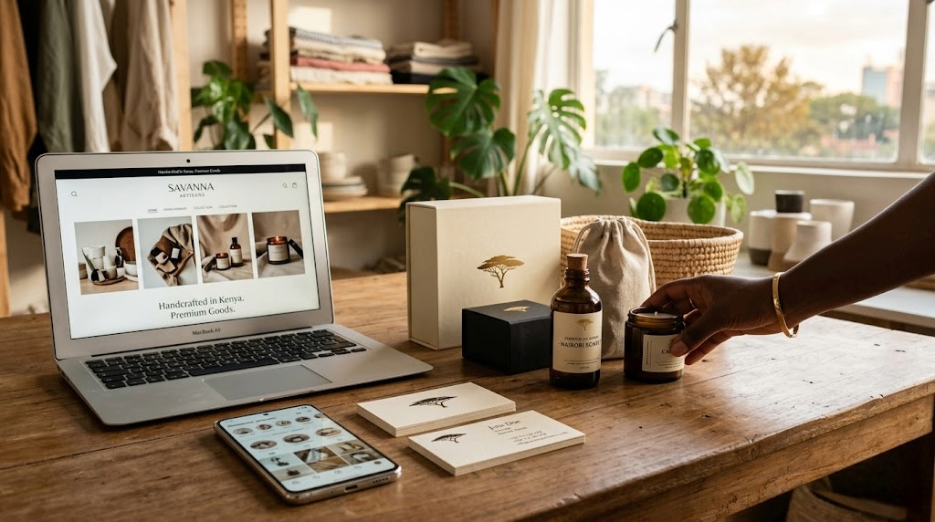
Apple doesn’t just make phones — they box them like jewellery. A small Nairobi bakery that photographs its pastries on marble backgrounds and uses consistent cream-and-gold colors feels more premium than the one that posts blurry photos with a yellow price tag overlaid in Comic Sans.
Same cake. Completely different perception of value.
Branding is not about lying about your quality. It’s about making your actual quality visible. And the good news? Most of what creates a premium feeling costs almost nothing — it’s just consistency, intention, and a few non-negotiable design decisions.
The 6 Things That Make a Brand Feel Expensive
1. Whitespace (the silence that speaks)
Expensive brands don’t cram information into every inch of space. They breathe. Look at any luxury brand — their website, their packaging, their social media. There’s space. That restraint signals confidence. ‘We don’t need to shout because we already know we’re good.’
Cheap brands try to fill every gap because they’re afraid of silence. Expensive brands understand that what you leave out is as powerful as what you put in.
2. Consistent typography
One font family. Maybe two. Used consistently across every single touchpoint — website, invoice, business card, social graphic, email signature. When everything matches, the brand looks intentional. When you’re mixing five fonts in one flyer, it looks like no one’s in charge.
Fonts carry personality. Serif fonts feel established and trustworthy. Clean sans-serifs feel modern and sharp. Script fonts feel handcrafted and personal. Pick the right one and stick to it.
3. A colour palette that doesn’t waver
Three colours, maximum four. Used consistently. Your primary brand colour, a supporting neutral, and an accent. That’s it. Expensive brands don’t introduce new colours every season. They have a signature look that their audience starts to associate with quality.
Think of the green of MPesa. The red of Safaricom. The blue of KCB. You know those colours without even seeing the name. That’s brand equity built through consistency.
4. High-quality photography
This is the single fastest upgrade any Kenyan business can make. Stop using stock images. Stop posting phone photos that are slightly blurred. One proper photoshoot — even a half-day with a decent photographer — gives you six months of content that makes everything look premium.
We’ve seen businesses transform their entire Instagram and website feeling with a single afternoon of photography. It changes how customers perceive pricing, professionalism, and quality.
5. Copy that sounds like a person, not a brochure
‘We are committed to providing world-class solutions to our esteemed clients.’ No one talks like this. And no one trusts it.
Expensive brands have a voice. They sound like a specific human being who knows what they’re talking about and doesn’t need to perform authority. Write like you’d talk to a smart friend, not like you’re submitting a government tender.
6. Logo that doesn’t try too hard
The worst logos are the ones with too much happening — gradients, drop shadows, three different symbols, and a font that does backflips. Premium logos are almost boring in their simplicity. A clean mark. A clear font. Nothing that dates in two years.
Simplicity is hard to achieve. That’s why it feels expensive.
A Real Example From Nairobi
We worked with a skincare brand based in Kilimani. They had the same products as competitors charging twice as much. After a brand overhaul — new logo, consistent color palette, professional photography, and cleaned-up packaging — they raised their prices by 40% and their sales volume actually increased. Same cream. Different perception.
Customers don’t buy products. They buy feelings. They buy the story a brand tells about what it means to own this thing.
What You Should Do Next
Audit your brand assets right now. Open your social media, your website, your last flyer. Do they all look like they belong to the same family? Is your logo clean and scalable? Are your photos actually good? Does your copy sound human?
If any of that is off, you’re leaving perceived value — and real money — on the table.
Internal link suggestion: Link to Majali Company’s Graphic Design / Branding Services page.
Your brand should look as good as your business actually is. Majali Company specialises in building brands that feel premium, authentic, and Kenyan. Let’s talk about what we can build for you — majalicompany.com
Leave a Reply